
A Skincare Brand Exploration
Tattoo enthusiasts and wellness shoppers were never supposed to want the same skincare brand. INK Skincare proves that was never actually true.
The Setup:
Explore how a distinctive brand could help a new entrant stand out in the wellness market.
The goal was to curate a distinctive brand identity that would appeal to tattoo enthusiasts and wellness gurus alike. Conveying product quality and natural sustainability was a top priority in a competitive beauty and wellness market.
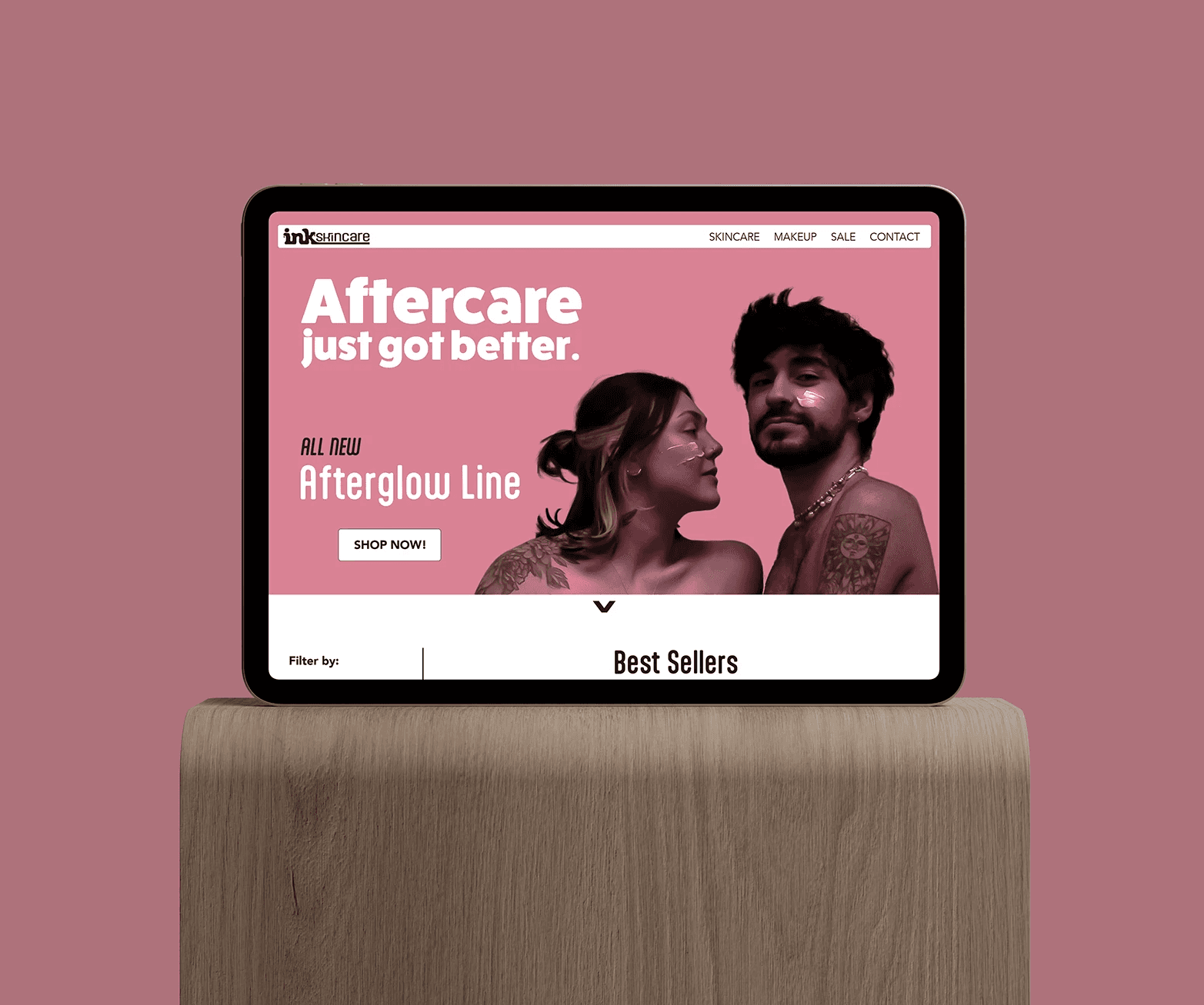
The Problem:
Skincare was not failing to serve one audience. It was failing to serve two, badly, at the same time.
Tattooed skin, and the people who celebrate it, are comfortable in worlds that most skincare brands do not speak to directly. Meanwhile, the broader skincare market values natural, effective formulations with transparent communication.
Neither side was being served well. Tattoo enthusiasts were not being seen by most skincare brands. Traditional skincare language felt generic and intimidating. Consumers who care about both aesthetics and ingredient integrity were underserved by either camp.
The real challenge was never "make a skincare brand for tattoo people." It was "build one identity bold and welcoming enough to credibly hold both audiences at once," without diluting into something generic enough to hold neither.
The Bet:
INK Skincare is positioned around a personality that could live confidently on both street-style culture and wellness shelves. That meant defining a bold, approachable brand voice, choosing a vibrant, neutralized color palette to convey energy without alienating non-tattooed skincare users, and building a visual system flexible enough to feel at home in either world.
This blend gave INK Skincare a personality that reads like the person everyone wants at the party: loud and fun, yet approachable and genuine.
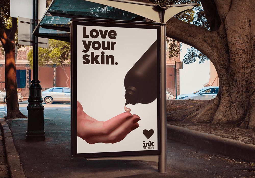

The Build:
A system that reconciles two truths instead of picking one.
Key strategic moves included selecting rounded, blocky typefaces that feel friendly and confident rather than clinical, and integrating organic graphic elements to signal natural, minimal-ingredient formulations without leaning into the sterile, lab-coat language most of the category defaults to.
Color did the heaviest lifting: bold but muted tones that read expressive without screaming, balancing energy with broad appeal. Typography stayed rounded and inviting rather than sharp and clinical. Graphics leaned organic, communicating nature, harmony, and skin health.
The Gallery:
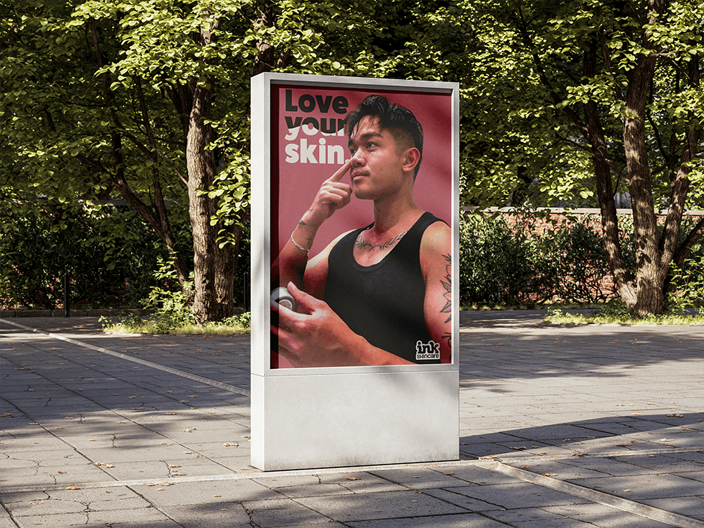

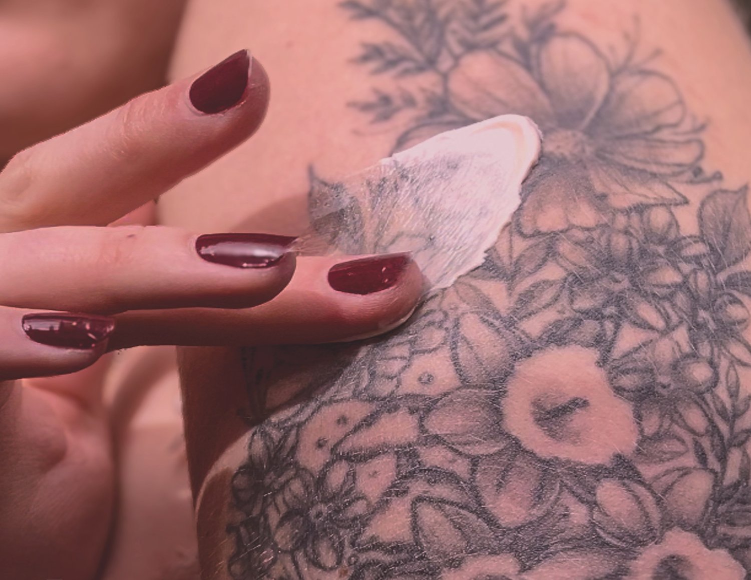

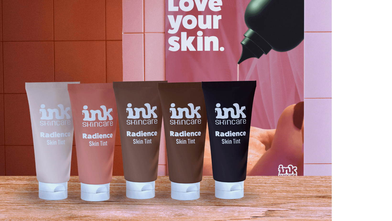


Why it works:
The design language directly supports the strategic narrative: all skin is beautiful, tattooed or not. Every choice had a reason, and none of them were there to look interesting on a moodboard. Color balances energy with broad appeal. Typography invites instead of intimidates. Graphics communicate integrity instead of just claiming it.
The Result:
INK Skincare emerged as a concept that feels distinct in category, emotionally resonant with tattoo enthusiasts, and genuinely approachable to everyday skincare users. The visual identity does more than look good. It communicates a clear personality and purpose that could help an emerging brand build memorable recognition and category relevance in a highly saturated market.