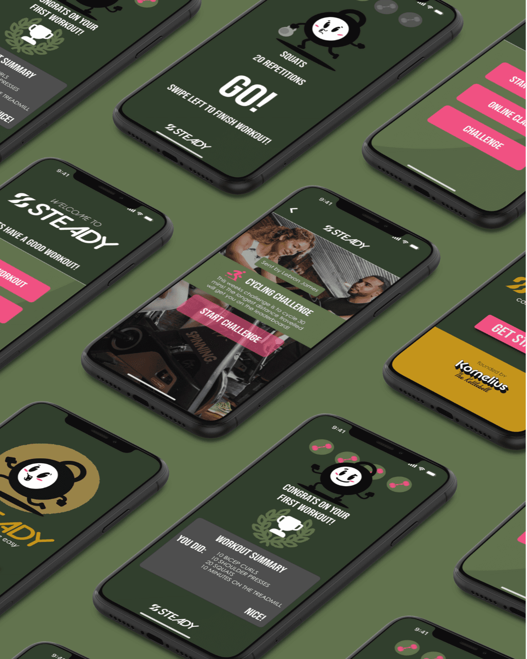
Workout app Product Strategy
Gym goers do not need another workout app. They need one that actually knows them. Introducing Steady, a conceptual platform built on adaptive intelligence and real community.
The Setup:
81.2% of gym goers in Calgary struggle with consistency and motivation.
Most rely on generic apps that do not adapt to mood, equipment, or goals. Without a supportive community or personalized guidance, they end up feeling disconnected instead of driven.
The Problem:
This was never an app problem, it was a relationship problem.
Every competitor was solving for tracking. More reps logged, more streaks counted, more data displayed. None of them were solving for the actual reason people quit, which is that working out alone, with a program that does not know you, gets lonely fast.
So the brief was not "build a better fitness app." It was "build something that adapts to a person the way a good coach or training partner would." That is a strategy problem before it is a design problem, and it changes everything downstream: tone, features, even what counts as a win screen.
The Bet:
The fitness category is loud, aggressive, and performative by default. Steady bets the opposite way. The product is positioned around adaptive AI that adjusts to a user's gear, mood, and preferences, paired with community features that replace the isolation most solo training apps create.
This meant deliberately avoiding the "hardcore fitness" visual and verbal language that saturates the category. Steady needed to feel less like a drill sergeant and more like a training partner who remembers what happened last week.
The Build:
A system built to feel understandable, fast & trustworthy long-term.
Every design decision traces back to the strategy:
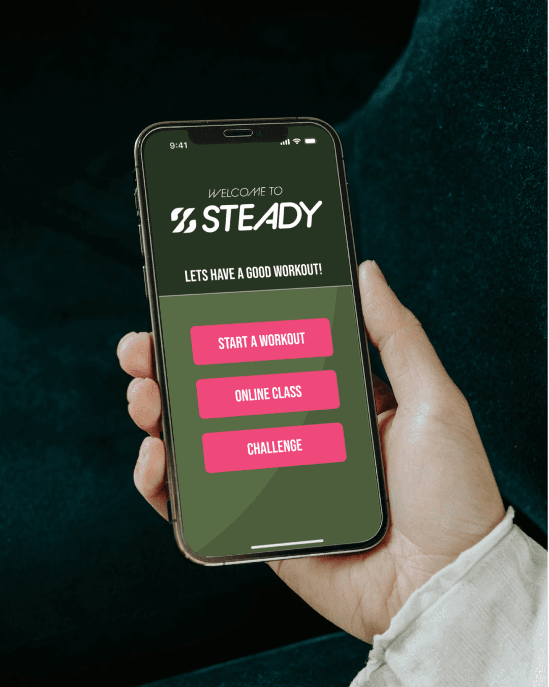
Color & Tonality: Warm, reassuring tones instead of the stale hardcore-fitness palette, chosen to communicate approachability and encouragement.
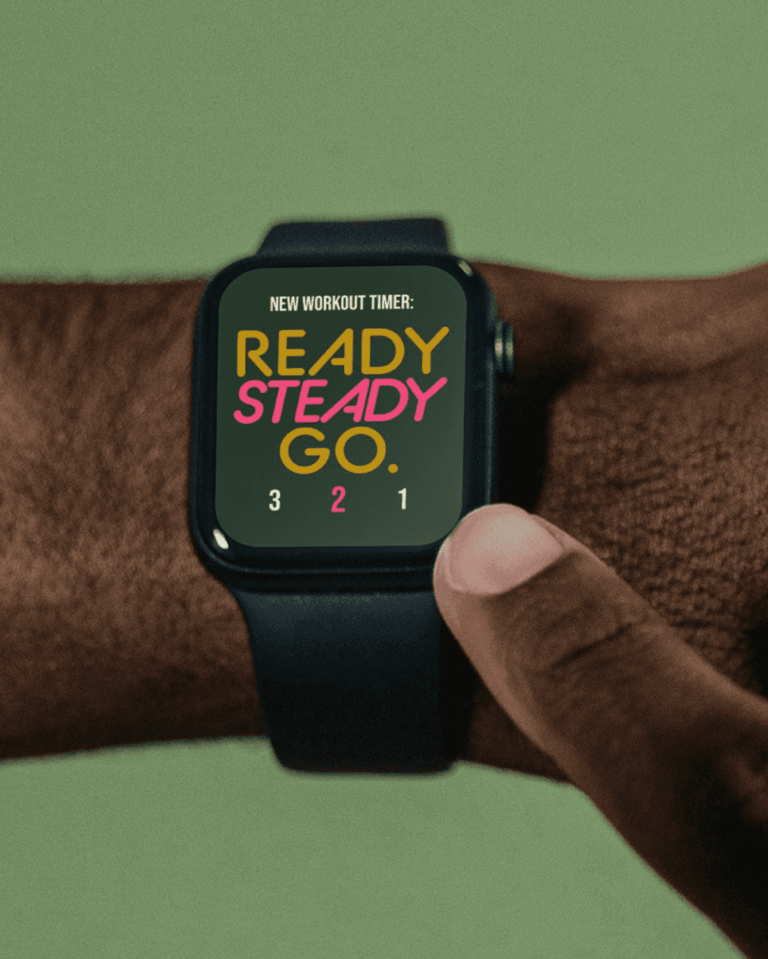
Typography & Structure: Clean, orderly type and structured layouts that reinforce clarity and predictability, critical for an audience that wants guidance, not noise.
Visual Motifs: Subtle patterns and movement cues that suggest rhythm and momentum, echoing the product's promise of building steady habits.
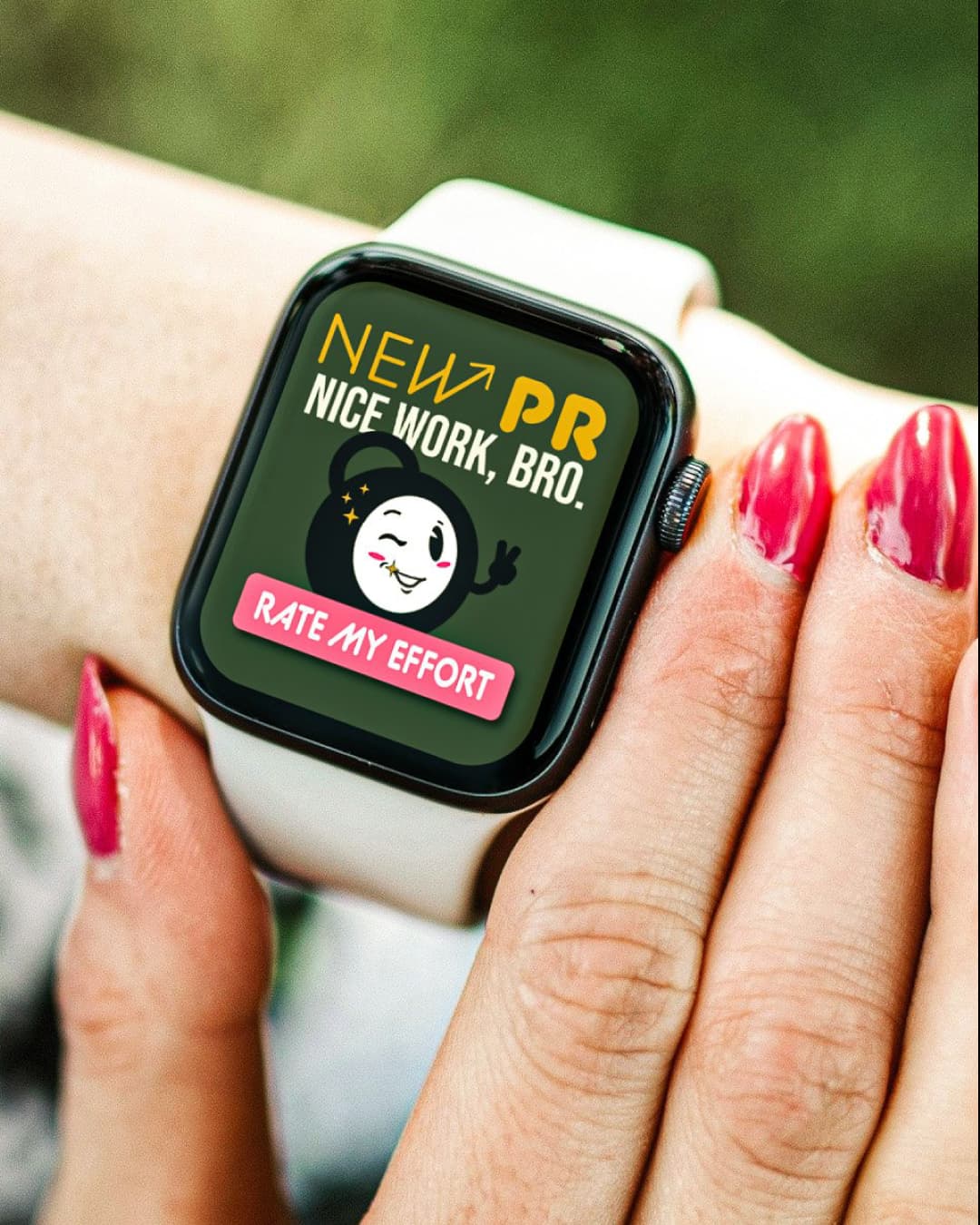
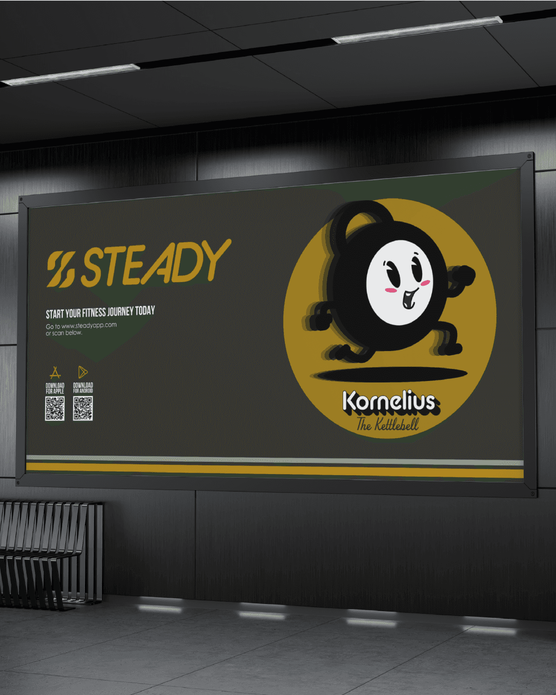
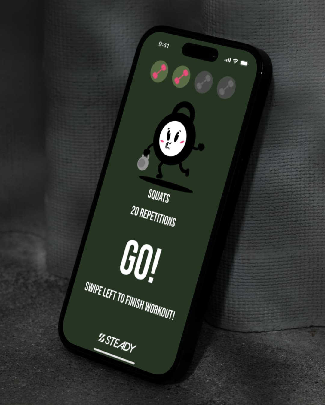
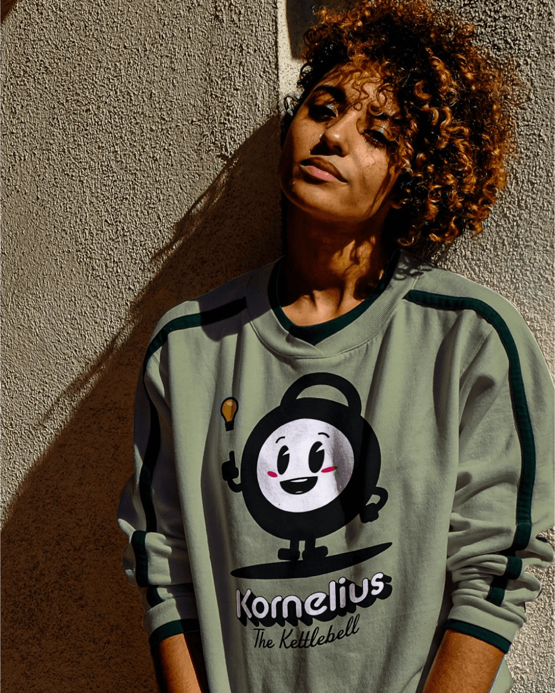
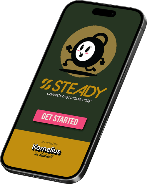
The Mascot, Kornelius: A friendly presence to walk users through their workout, giving the product a face instead of just a dashboard.
Nothing here is decorative. Every choice serves the dual purpose of making the brand feel understandable fast and trustworthy long-term.
The Gallery:




Why it works:
The mascot is the clearest proof of the strategy at work. A less considered version of this brand would have skipped it entirely, or worse, made it a gimmick. Instead, Kornelius exists because the reframe demanded a relationship, not just a ranking system, and a friendly presence does more to fight isolation than another leaderboard ever could.
The Result:
As a concept, Steady demonstrates a brand system that gives leadership a coherent internal framework, gives users messaging that actually speaks to their motivations, and gives the product visual systems robust enough to scale across campaigns, onboarding, and future features. It is proof that a fitness brand can compete on empathy instead of intensity, and win.